How to Make Instagram News Graphics (Without a Designer)
News pages live and die by speed. A story breaks, and the page that posts a clean, branded graphic first gets the shares. The problem: most "make a graphic" advice assumes you're a designer with time to spare. You're not. Here's the workflow that actually works when you need a post out in the next ten minutes.
1. Start from the story, not a blank canvas
Don't open a design tool and stare at it. Start from the article itself — the source link has everything you need: the angle, the key fact, and usually a decent image. Your job is to compress it into one frame, not to redesign it.
If you take one thing from this post: the fastest workflow is one that begins with the URL and works forward, instead of starting from an empty template.
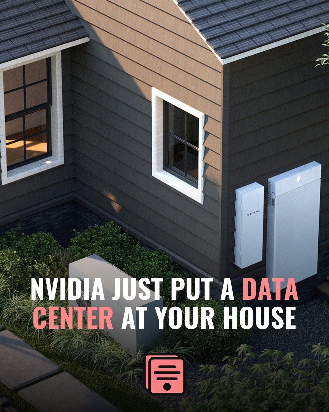
2. Write a headline that earns the stop
A feed headline is not the article headline. It has about half a second to make someone's thumb stop. The rules:
- Lead with the hook, not the context. "Council just killed the downtown plan" beats "In a meeting Tuesday, the city council voted…"
- 8–12 words. Longer and it won't fit at a legible size on 1080×1350.
- Highlight one or two words in your brand color so the eye lands somewhere. A single accented word does more than a whole bold sentence.
If you're staring at a blank box, this is the slowest manual step — which is why letting an AI write a first-draft headline (then editing it) saves the most time. You keep the editorial judgment; you skip the blank-page tax.
3. Get a background that fits the story
Three options, fastest to slowest:
- Use the article's own image — fastest, and readers recognize it.
- Generate a background that matches the mood (editorial, breaking, lighthearted).
- Pull from stock — slowest, and everyone's seen it.
Whatever you choose, the background's job is to support the headline, not compete with it. Darken it, add a gradient, or push it behind a color block so the text stays readable.
4. Keep the text real — never baked into pixels
This is the step that separates credible news pages from sloppy ones. Your headline must be rendered as real text, not drawn into an AI-generated image where it can misspell or warp. A typo in a news graphic is a screenshot waiting to happen.
The reliable approach is to composite: AI (or stock, or the article photo) handles the background, and a template engine lays the headline and caption on top as actual type. That's the core idea behind BlurbStack — the words are never pixels, so they're always sharp and correct. If you want the full reasoning, see our breakdown vs. Canva.
5. Stay on-brand, every single time
One-off posts are easy. The hard part is making post #400 look like post #1 — same logo placement, same fonts, same accent color. Consistency is what makes a page feel like a publication instead of a hobby.
Lock your brand kit once — logo, colors, fonts, default template — and apply it automatically to every post. Doing this by hand across a busy posting schedule is exactly where pages slip.
Putting it together
The whole loop should take minutes, not an afternoon: story → headline → background → legible text → brand kit → post. Done by hand in a general design tool, it's doable but slow. Done in a pipeline built for it, it's a paste-and-publish job.
That's the bet behind BlurbStack: paste a news link and get a finished, on-brand 1080×1350 post with a real-text headline in seconds. If you run multiple pages or clients, the time savings compound fast — see how it works for social media managers and local news pages. And if you're still deciding on dimensions, start with our Instagram news graphic size guide.
Turn your next article into a post.
Paste a news link and BlurbStack writes the headline, caption, and background image in seconds.
Try BlurbStack free